OFFERS REDESIGN
Overview
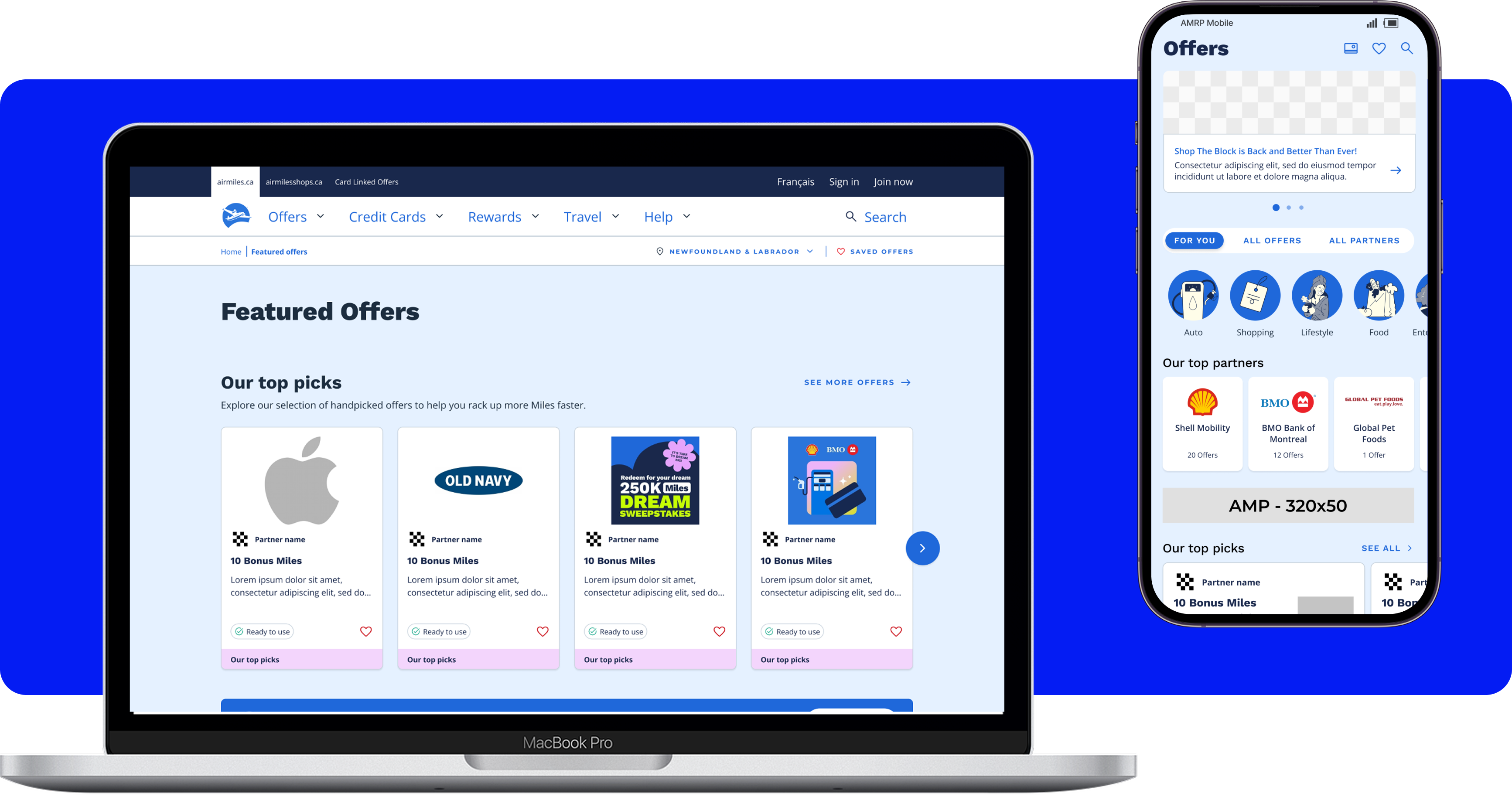
The Offers experience on web and app is the primary way that our collectors earn Miles from their everyday purchases. This section highlights our ongoing promotions and gives collectors a quick view of where to shop and what they will earn in return, making it central to both the collector experience and the business. In early 2025, I was brought on to the project as the UX lead with a seemingly simply ask: improve the Offers experience.
Before I could start designing, I needed to understand how collectors currently understood and used our Offers in their lives. Through research, we uncovered a clear root cause of collector frustration, designed a solution grounded in data and evidence, and shipped it incrementally to maximize impact — all of which was reflected in our results after launch.
Research & Discovery
Our first glimpse into the issue came through a card sorting activity to understand a collector's mental models around different types of offers. I partnered with a UX Researcher on our team who led an open card sort with 38 participants across collectors, non-collectors, and Air Miles associates. The majority of the participants organized the offers by their product category, which directly contradicted how the page was previously organized. This card sort revealed that the biggest issue was that the navigation had been built around how Air Miles calculates earnings internally and not how collectors actually think about shopping.
As these findings upended our current IA, my UX Research partner and I ranuser interviews and testing sessions to map out the collector's journey and uncover smaller pain points. We interviewed 5 different collectors and probed them on their use of offers before asking them to walk through the live mobile app experience.
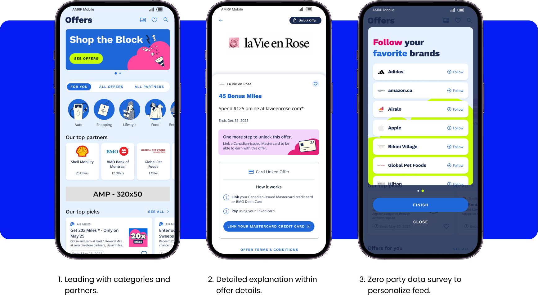
We found that collectors had difficulty browsing the offers and skipped past the top-level carousels, relying instead on the "All Offers" and "All Partners" sections for their browsing. These interactions highlighted that our current organization of the offers was not supporting their goals and emphasized how lost our collectors became in the face of 100 different offers with no organization. Sections of the experience used language to imply that they were personalized (such as "Your Top Partners") when they were not actually based on collector data. Collectors recognized this immediately. Collectors also noted that Card Linked Offers did not provide enough information for collectors to understand how to earn with this offer type.

Approach & Design Decisions
Reorganizing the entire Offers page was the most significant change to the Offers experience in approximately five years. I knew that previous intiatives had failed when it came to presenting back to stakeholders. With so many different teams with various and sometimes competing KPIs, I knew that the key to success in this project would be to bring the right people along from the beginning. Before ever touching Figma, I sat down with all my stakeholders across Strategic Partnership, Product, Marketing, and Offer Ops to understand how their work influences the Offer portfolio and how they measure success in the space. This allowed me to more deeply understand the complexity of the product and create design solutions that supported both the collectors and my stakeholders in achieving their goals.
To address our issues of page structure, I brought together all the offers across Air Miles into one page and organized them in a way that is easily scannable and clear. By using product categories instead of earn method as our main filtering method, I mitigated any decision paralysis our collectors might face while reviewing all of our offers. In addition, rather than relying on our collectors to recall how each offer works while shopping, the new experience tests out an approach that highlights the exact steps a collector need to take to earn their Miles. To address the trust issues surfaced in the research, I introduced real personalization into the experience. Since our backend is not very reliable when recommending offers, the new approach allows collectors to answer a survey to personalize their offer feed to deliver more relevant offers.
I validated these changes with another round of user testing, where a new set of collectors were asked to complete the same tasks on the redesigned experience. We found that each design decisions all had a positive impact on the collector's experience; all participants understood the zero party data personalization flow and it aligned with their expectations; all participants understood what actions were required to use an offer; and multiple paths were used and understood to explore offers. The collectors did still report confusion around Card-Linked Offers, highlighting that more work can be done to increase collector comprehension and gave us a direction for our next iteration of design.
Working closely with our Senior Product Manager, I mapped out a phased release plan prioritizing the highest impact changes for the lowest development effort. Two releases have shipped so far, establishing the new IA structure and navigation. Features including locked offers, partner following, and enhanced offer detail instructions are still to come — and we're already seeing strong results from what's live.
Outcomes & Impact
After the initial launches, we've monitored our analytics closely to fully understand the extent of our impact. The new experience was validated in an A/B test against the original version across four metrics. It outperformed the control across each one:
- Offer Engagement Rate improved by 13.5%
- Internal Link Clicks per Visitor improved by 23.6%
- Offer Detail Click Rate improved by 17.9%
- Offer Saves / Opt-Ins improved by 13.1%
Offer Engagement Rate measures total clicks, saves, and opt-ins as a combined metric.
These results reflect only the first two releases. Features including locked offers, ability to favourite partners, and enhanced offer detail instructions are still to come.
I was asked to improve the Offers experience, and the data shows I did exactly that.

