OFFERS REDESIGN
Project Brief
Air Miles is one of Canada's largest loyalty rewards programs, helping millions of collectors earn and redeem Miles on everyday purchases. The Offers experience, on web and app, highlights ongoing promotions and is the primary way collectors earn Miles. In early 2025, the Offers product team set out to define what collectors wanted from their ideal offers experience, informing a build-or-buy decision for the new experience.
The Challenge
The existing Offers experience is a legacy design that hasn't seen a strategic redesign in years, despite growing bloat from new offer types. Collectors have to manually sort through hundreds of offers across multiple digital channels to find what's relevant to them. Market research shows collectors expect their offers to be simple and relevant, two marks our experience currently misses.
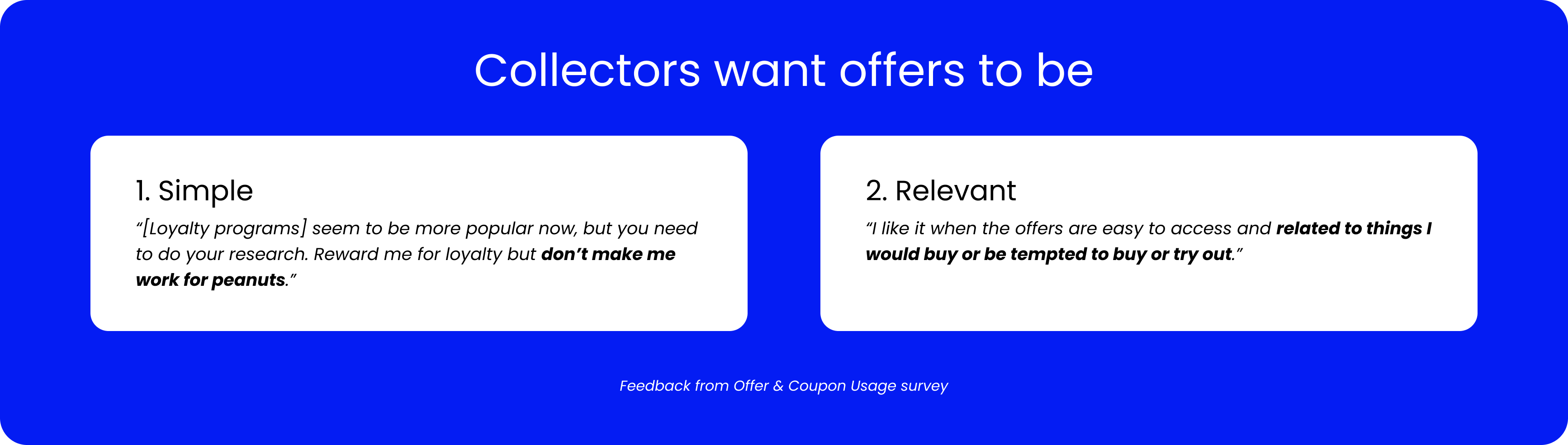
Collectors want a loyalty program that fits into their daily lives without extra effort. Every interaction is a value exchange in their eyes: is the effort worth what they get back?
Research & Discovery
Offer Card Sort
To test whether our organization of offers matched collector expectations, I partnered with a UX Researcher to run an open card sort. 38 participants sorted 39 live offers into categories of their own creation.
Most participants organized offers by product category, directly contradicting how the page was previously structured. Our experience had been built around how Air Miles calculates earnings internally, not how collectors actually think about shopping.

User Interviews & Testing
To dig further into this, we ran user interviews and testing sessions to uncover additional pain points. We interviewed 5 collectors, probing their use of offers before walking them through a live mobile app experience.
These sessions revealed the following:
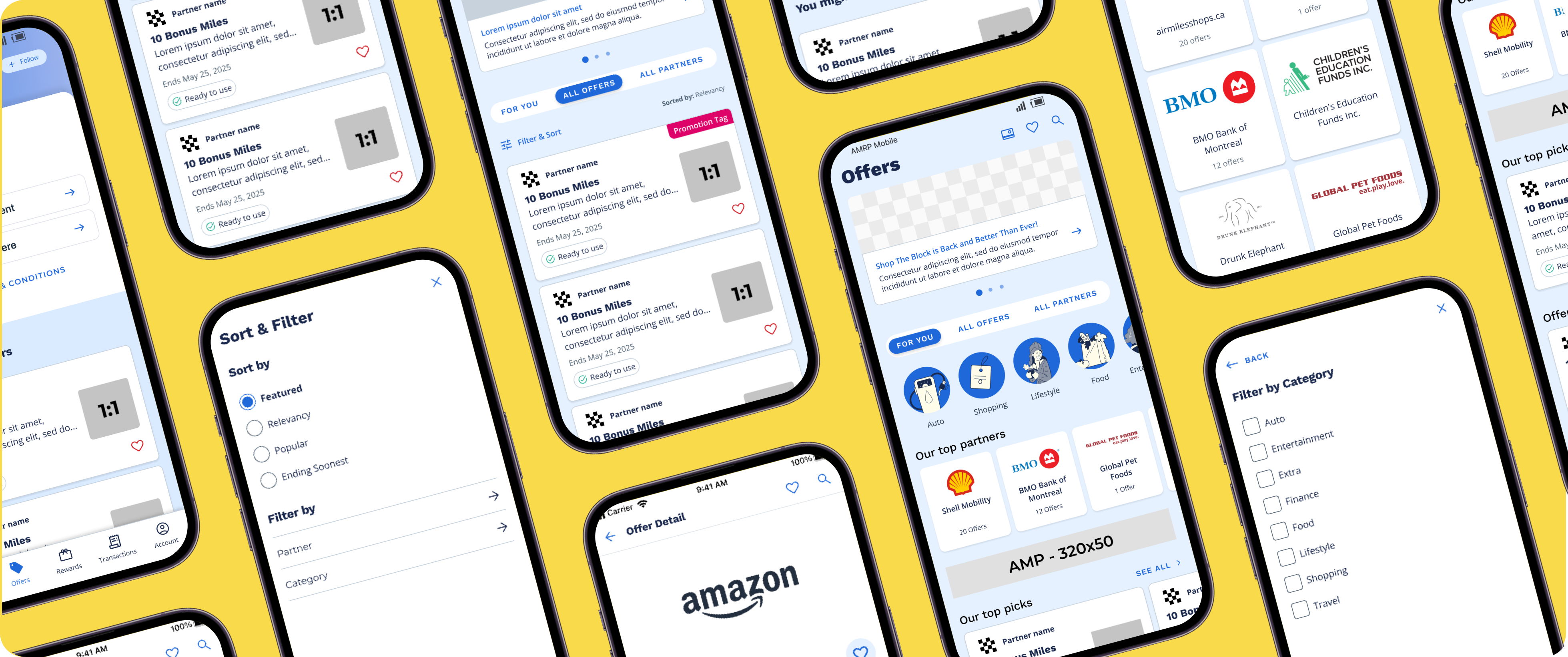
- Difficult Browsing:
- Collectors skipped the top-level sections entirely, relying solely on "All Offers" and "All Partners" to browse, a clear sign our current organization wasn't working. Card Linked Offer cards were too confusing for collectors to understand.
- Lack of Personalization:
- Sections of the experience implied personalization ("Your Top Partners") without being based on any collector data. Collectors noticed immediately and questioned why they were shown partners they don't engage with.
- Missing Details:
- Collectors found the offer cards too difficult to scan and quickly understand. Key information, like when an offer expires, was missing from the card and only visible on the offer detail page.

The Design Approach
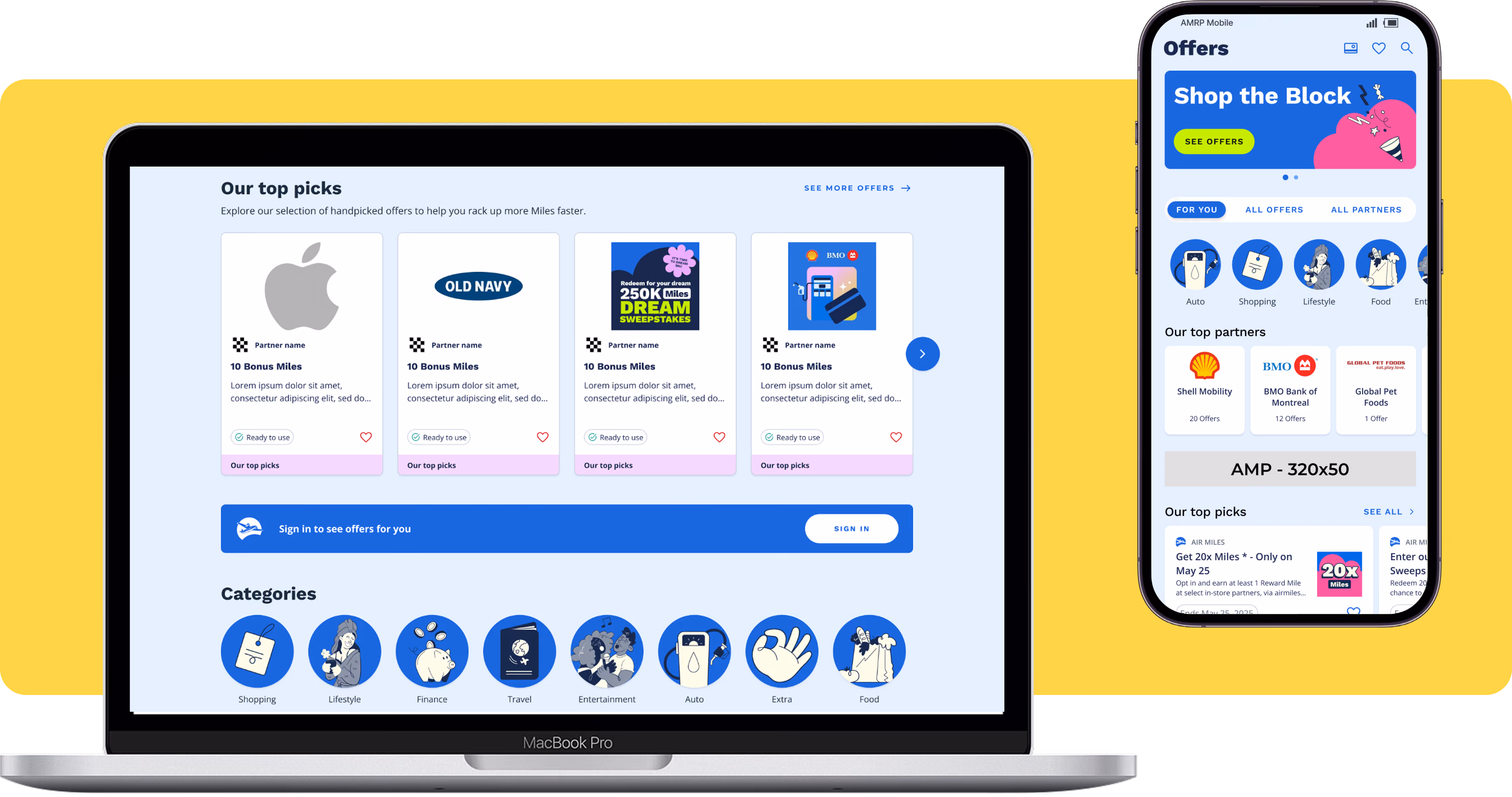
My solution cuts through the noise of hundreds of live offers, helping collectors find what matters to them faster. Personalization does the rest, surfacing the partners and offers most relevant to each collector.
Page Structure
My biggest priority was aligning our offer organization to the mental models we saw in the card sort. I brought every offer across Air Miles onto one page, organized into product categories defined through mapping sessions with product and marketing leads, cutting the decision paralysis we saw in testing.
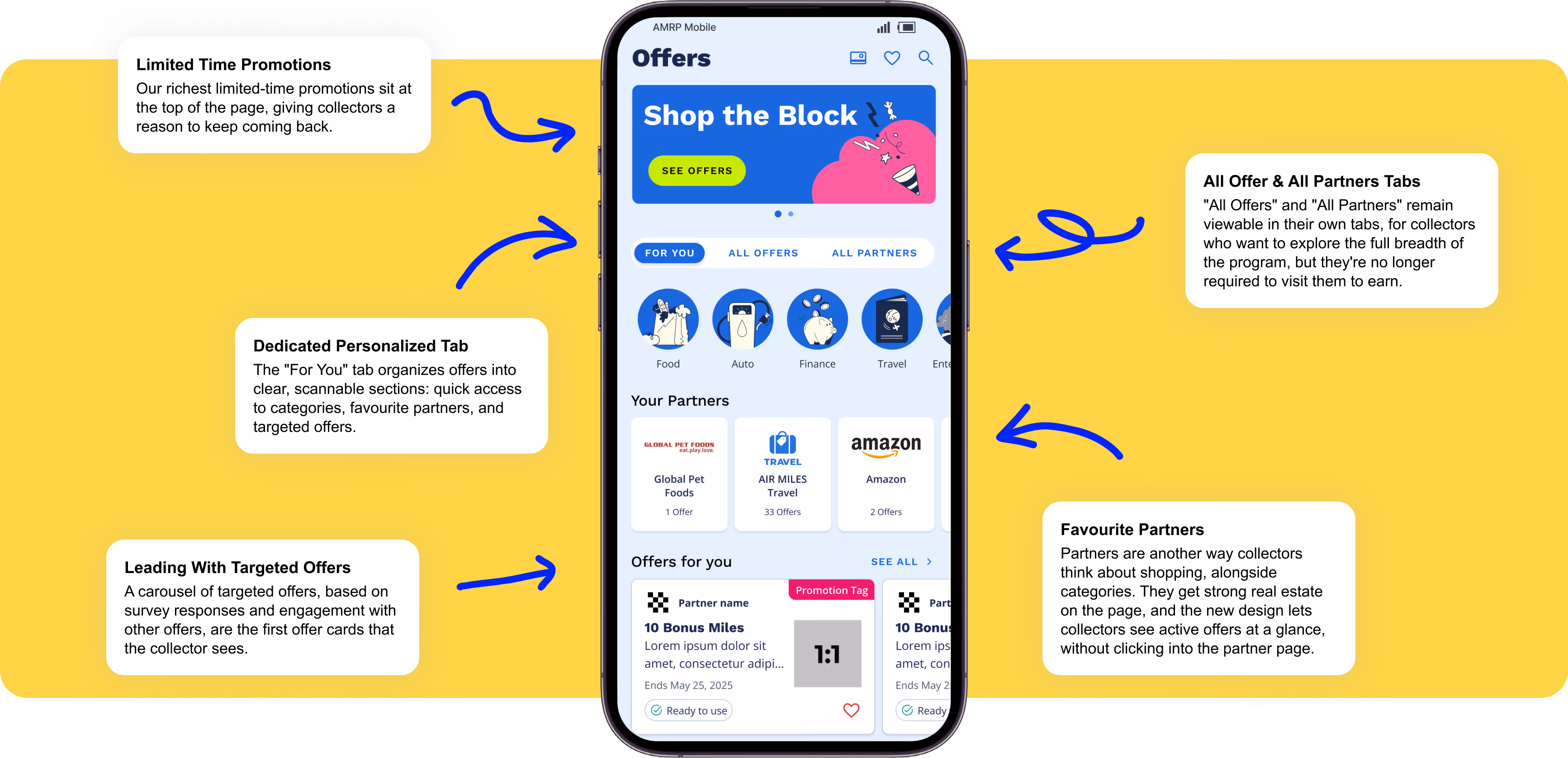
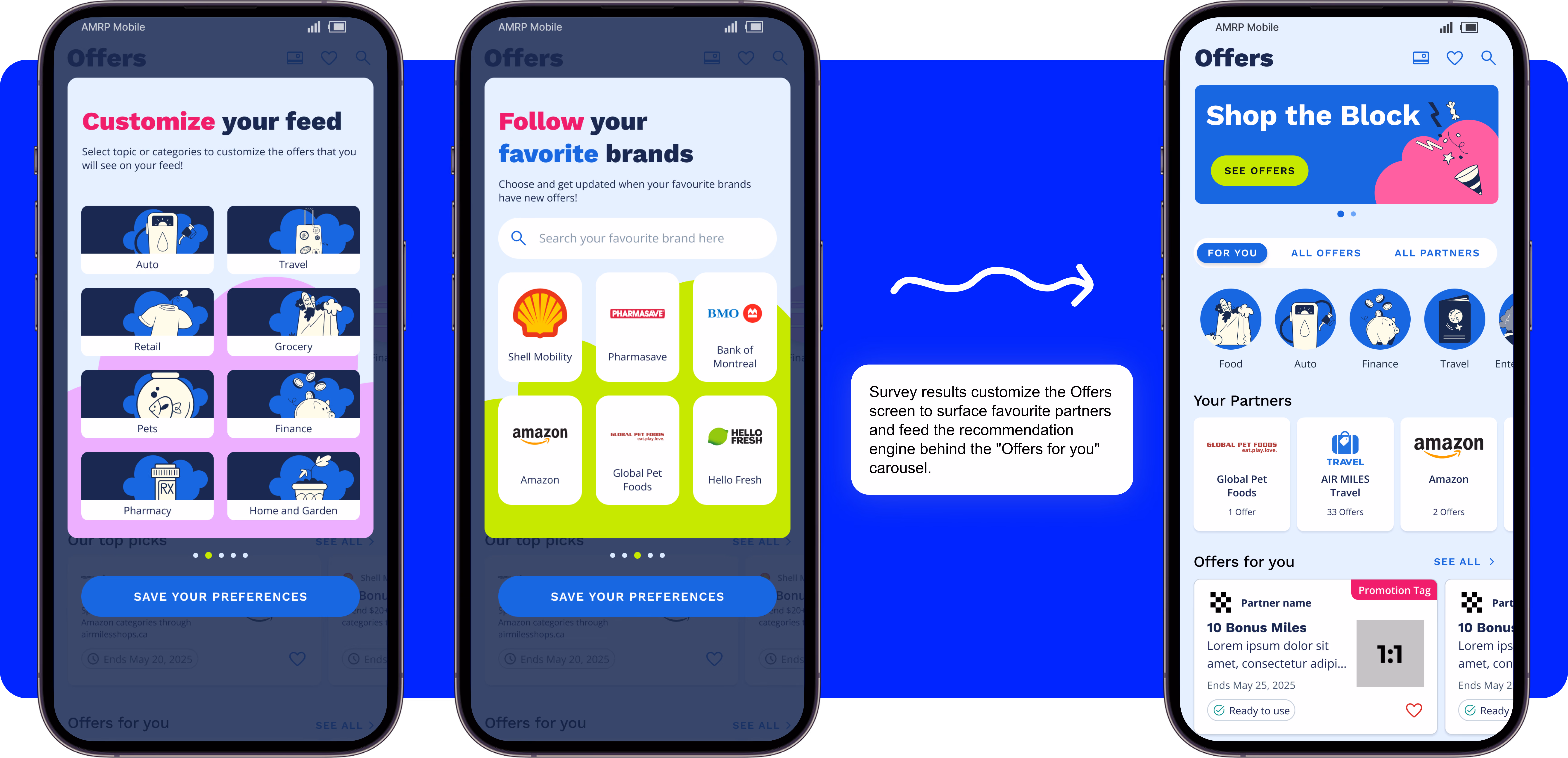
Personalization & Customization
Knowing our recommendation engine wasn't as precise as collectors expected, I designed an approach using zero-party data from a quick in-app survey to surface more relevant offers and highlight favourite partners, especially valuable for new collectors we know nothing about yet.
Card Structure & Mechanics
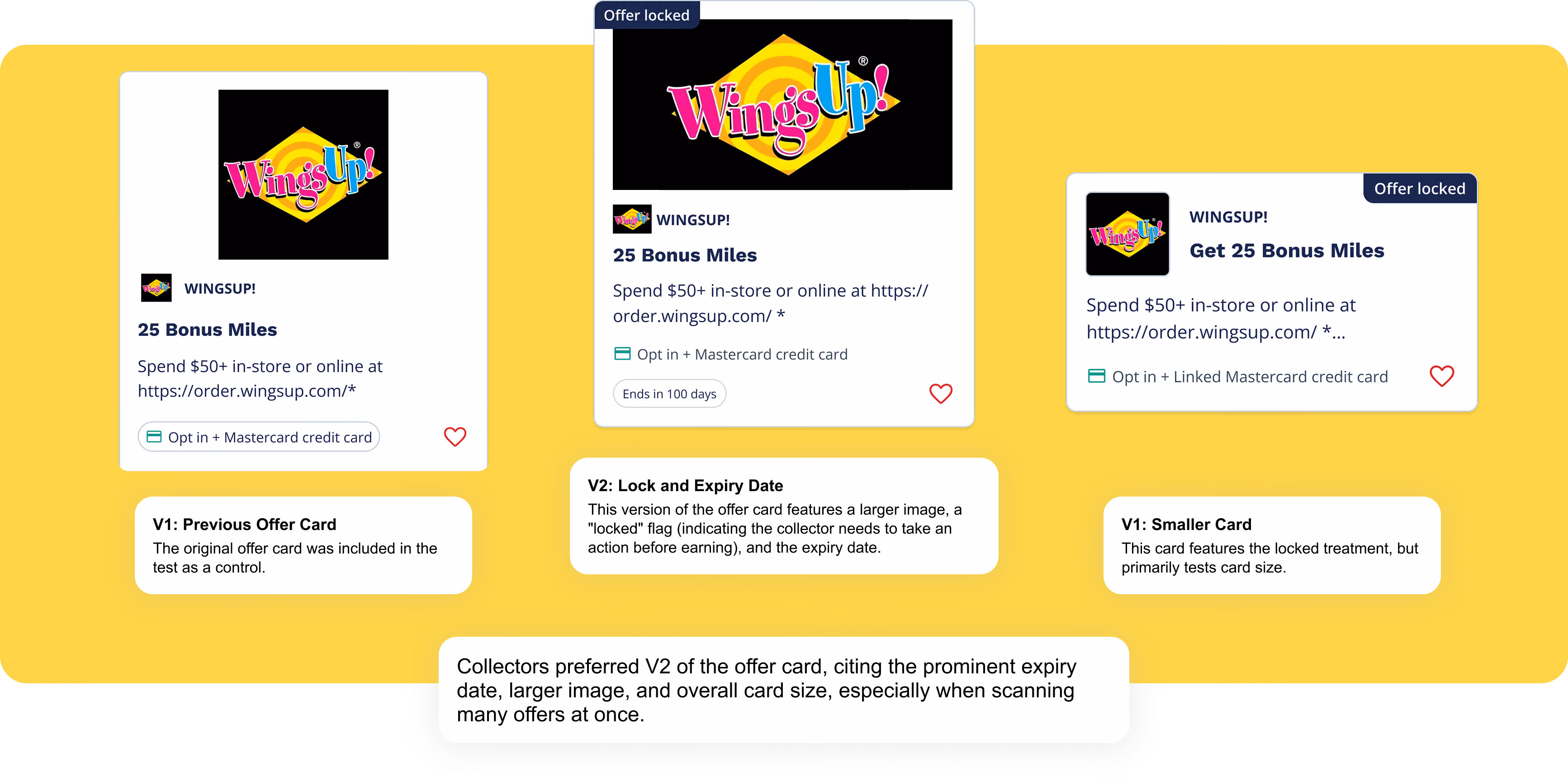
The redesign added expiry dates to the offer cards, information collectors had directly flagged as missing. To simplify the card further, we surveyed 158 collectors on their preferred design from three options that varied promotion tag position, image size, and offer mechanic visibility.
Testing & Iterating
I validated these changes with a second round of testing, asking a new set of collectors to complete the same tasks on the redesigned experience. The new experience marked a clear improvement: participants successfully explored offers through multiple paths, understood the actions required to use our most complicated offer, and found the zero-party data personalization flow matched their expectations.
Collectors still struggled to understand our most complicated offer, which pushed me to change approach. Instead of relying on collectors to recall how an offer works from a tag on the card, the new designs spell out the exact steps they need to take to earn Miles.

The Outcome
Two releases have shipped so far, establishing the new navigation and adding detailed steps on our most complicated offers. Locked offers, simplified offer cards, and the zero party data survey are still to come.
The new experience was validated in an A/B test against the previous version across four metrics. It outperformed the control across each metric:
- Offer Engagement Rate improved by 13.5%
- Internal Link Clicks per Visitor improved by 23.6%
- Offer Detail Click Rate improved by 17.9%
- Offer Saves / Opt-Ins improved by 13.1%
Offer Engagement Rate measures total clicks, saves and opt-ins as a combined metric.